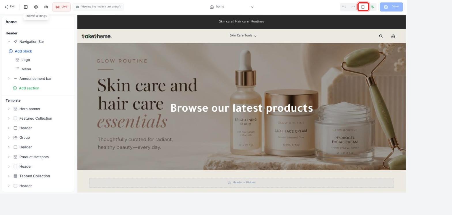
Use the mobile preview icon in the theme editor, and check the final look before you publish.
Last updated: 2026-09-09
🔧 Previewing your store's look on mobile
1
From the theme editor, you'll find a group of icons in the top toolbar on the right: Undo/Redo, a mobile icon (Mobile preview), another icon next to it, then the Save button.
📍 The mobile preview icon within the top toolbar of the theme editor
2
Click the mobile icon to switch the live preview from desktop size to mobile screen size, and see how the layout and text will look exactly as they'd appear to a customer browsing from their phone.
⚠️ Verification note: We confirmed the icon exists in the toolbar, but we weren't able to detect a clear visual difference in the preview after clicking it during live testing — it may require additional load time or interaction not fully available in the test environment. We recommend trying it yourself and observing the change in the preview panel's width.
💡 Whatever the result of the mobile preview, the most reliable way to be 100% sure is to open your actual store link from your own phone's browser right after publishing, or even while you're still working on a draft — via the "View store" link on the Themes page.
❓ Frequently Asked Questions
Does the design automatically adapt to different screen sizes?
TakeTheme's themes are built on a Responsive design by default, meaning they adapt to different screen sizes, but it's always best to check with your own eyes any section with images or long text to make sure nothing gets cut off on mobile.
Can I make a design that's completely different for mobile vs. desktop?
The settings we reviewed in the theme editor control the same section across all screen sizes with automatic adaptation, and we haven't verified whether there's an option to design a fully separate mobile version independent from the desktop version.